How to Use GPT Image 2.5: Flare, Sunburst and References
To use GPT Image 2.5, open the GPT Image 2.5 model page, choose Flare or Sunburst, and select Text to Image or Image to Image. Write a prompt, add references if needed, choose the available resolution and ratio, check the credit quote, and generate. Review the returned image before downloading it.
As of October 12, 2026, ClipTrend offers both variants, up to 16 reference images per edit, and 1K, 2K and 4K output where the chosen ratio supports them. Below are the steps for making a poster, combining room references, and creating an illustration. The three prompts are suggested examples, not promises of exact results.
1. Open the model page and choose your variant
The page opens with GPT Image 2.5 Flare selected. Keep it for everyday image generation when you want to explore a visual direction quickly. Select Sunburst when a demanding image or precise edit warrants a longer wait.
Those roles come from OpenAI's Flare model page and Sunburst model page. They describe the models' intended strengths; they do not guarantee which variant will produce your preferred composition.
OpenAI released the variants on September 8, 2026, as recorded in its API changelog. The name inside ChatGPT is ChatGPT Images 2.5, as shown in OpenAI's announcement. This walkthrough covers ClipTrend's controls. You do not need an OpenAI account to use this page; sign in to ClipTrend when generation requires it.
2. Decide whether you are creating or editing
Choose Text to Image when the written brief supplies the scene. A fictional book cover, a new illustration or a poster without a source photograph can start here.
Choose Image to Image when an uploaded asset must guide the result. That could be a room photograph whose layout should remain recognizable, a product whose shape matters, or a drawing you want to reinterpret. Describe the intended change and the details you want retained.
The same variant names appear in both modes. After switching modes, confirm that the intended variant is still selected. Do not assume that a previous model choice or framing choice carried over.
For an edit, separate the instruction into two parts: change and preserve. “Replace the gray rug with the rug in image 2; preserve the camera angle, windows and chair” gives a clearer task than “make this room nicer.”
3. Upload references and name their roles
Both variants accept up to 16 reference images per edit on ClipTrend. That is a capacity, not a target. Two well-chosen files can be more useful than a bundle of unrelated pictures.
Keep a simple record of upload order. For example, image 1 can define the room, image 2 the chair, and image 3 the rug. Name those roles in the prompt and check the displayed thumbnails before submitting. If you remove or rearrange a file, update the image numbers in the text.
A practical reference set has:
- A primary image defining the composition or subject.
- Additional files showing specific objects, materials or visual style.
- A written instruction stating what to borrow from each file.
Avoid asking two references to define incompatible room layouts. If one image supplies the furniture and another supplies only the color palette, say so. For an existing photograph, identify the features that must survive the edit rather than relying on “keep everything else” alone.
Use photographs and artwork you have permission to upload. Remove personal details that the task does not need. For a more focused discussion of preserving a source subject, see the GPT Image 2.5 reference-editing guide.
4. Set resolution and aspect ratio for the destination
Choose the shape before filling the frame with important content. A tall poster, a horizontal presentation image and a square thumbnail need different layouts. Describe where the subject should sit and where you need clear space.
As of publication, ClipTrend lists 1:1, 3:2, 2:3, 16:9, 9:16, 4:3, 3:4, 21:9, 27:16, 16:27, 9:8 and 8:9, plus auto. Most listed ratios support 1K, 2K and 4K. 27:16, 16:27, 9:8 and 8:9 are offered at 1K only. Use a supported combination shown in the picker.
Start at 1K when you are deciding composition. Choose a larger supported output when the destination needs it, then inspect the actual downloaded file at its intended display size. A larger image does not automatically fix a misspelled word or a missing object.
For a poster, leave margins around the headline. For a room, keep the furniture away from the crop boundaries. Auto can be useful when the prompt should guide the shape, but an explicit ratio is easier to plan around for a fixed placement.
5. Write the subject, layout and exact text
A useful prompt gives the generator a scene and a short set of priorities. Describe the subject, composition, lighting and style. Put text that must appear in quotation marks, then say where it belongs.
For a poster, separate the headline from the supporting copy. Avoid burying important words inside a long paragraph about textures and lighting. Specify only the lettering the image actually needs; shorter copy is easier to inspect and correct.
For an edit, the words should also identify the references. “Use the chair from image 2” is more actionable than “use the chair.” Explain what should stay unchanged, especially the source object's silhouette, distinctive details and relative placement.
Prompt 1: a ceramics workshop poster
Suggested setup: Text to Image, Flare, 2:3, 1K for the initial layout.
Create a vertical poster for a small ceramics workshop. Warm cream background, one cobalt-blue handmade bowl in the lower half, restrained orange geometric accents, and generous margins. At the top write exactly "Clay & Color" in large readable lettering. Beneath it write exactly "Sunday Studio Session". At the bottom write exactly "Bring your curiosity". Keep the three text areas separate, with no additional words, prices, logos or invented contact information. Flat editorial design with a subtle paper texture.
The ampersand, capitalization and wording are part of the brief. Check each line in the result. If the overall design works but the lower line is wrong, make a targeted revision or finish that text in your design editor.
Prompt 2: a room mockup with three references
Suggested setup: Image to Image, your chosen variant, 4:3, 1K. Upload a room as image 1, a chair as image 2, and a rug as image 3.
Use the living room in image 1 as the base. Replace its armchair with the blue chair from image 2, preserving that chair's curved back, wooden legs and fabric color. Put the ochre rug from image 3 beneath the chair and coffee table. Keep the room's windows, wall color, camera viewpoint and sofa in their existing positions. Match the new objects to the room's daylight and floor perspective. Do not add people, lettering, extra furniture or a new window.
This is a visual mockup, not a measurement plan. Confirm the chair's proportions and rug placement yourself. Do not use a generated perspective as evidence that real furniture will fit a particular room.
Prompt 3: a landscape illustration
Suggested setup: Text to Image, Flare, 16:9, 1K for composition.
A small paper bird resting on a floating island of folded green paper, with a distant pale-yellow moon and three soft clouds. Landscape composition: put the bird and island in the right third, leaving the left half calm and open for a title added later. Hand-cut paper illustration, visible layered edges, gentle studio shadows, cheerful muted colors. No letters, symbols, watermark or logo. Keep the bird's wings folded and the scene uncluttered.
This example leaves space for text added afterward. That approach is useful when the wording will change across versions or needs exact typography from a separate design tool.
6. Confirm the settings and generate
Check the selected mode, variant, references, ratio and resolution immediately before Generate. Read the current credit quote after changing a setting. Both variants use equal ClipTrend credits for equivalent output settings; reference editing also uses the same credit pricing as a text prompt at the corresponding resolution.
Generate once you are satisfied with the brief. If an uploaded file is still processing or a requested setting is unavailable, address that input first. Repeatedly pressing Generate does not clarify the prompt or resolve a reference conflict.
When the result arrives, compare it with the actual request. Read every visible word, inspect object boundaries, and check whether the reference-defined details survived. A pleasing thumbnail can hide a warped chair leg or a small spelling error.
7. Download the approved image
Use the returned image's download control after reviewing it. Open the saved file and confirm its dimensions, crop and legibility in the application where it will be used. Keep the prompt and the ordered reference list alongside the approved asset so a future revision has a clear starting point.
If the image needs another pass, choose one correction: the headline, object placement, lighting or a preserved detail. Avoid switching variant, changing every reference and rewriting the whole scene together. That makes it difficult to understand which choice helped.
For the model-choice decision, the Flare versus Sunburst comparison explains what their different priorities mean for a finished asset.
FAQ
How many reference images can I upload?
ClipTrend accepts up to 16 references per GPT Image 2.5 edit for both variants. Use only files with a defined role, and name their upload positions in the prompt.
Why is a ratio available at 1K but not 4K?
ClipTrend currently offers 27:16, 16:27, 9:8 and 8:9 at 1K only for these variants. Choose one of the other supported ratios when you need a larger output, and check the picker before submitting.
How do I ask for exact words in an image?
Put the exact words in quotes, specify their placement, and ask for no additional text. Inspect spelling and punctuation in the returned image. Use a separate design editor if essential copy still needs correction.
Where do I download the result?
Use the download control on the completed image, then open the saved file to check it at the intended size. A browser preview alone is not a complete check of the delivered asset.
Can I use the model page without an OpenAI account?
Yes. The generator is available through ClipTrend. Sign in to ClipTrend when prompted and review the credits shown for your chosen settings.
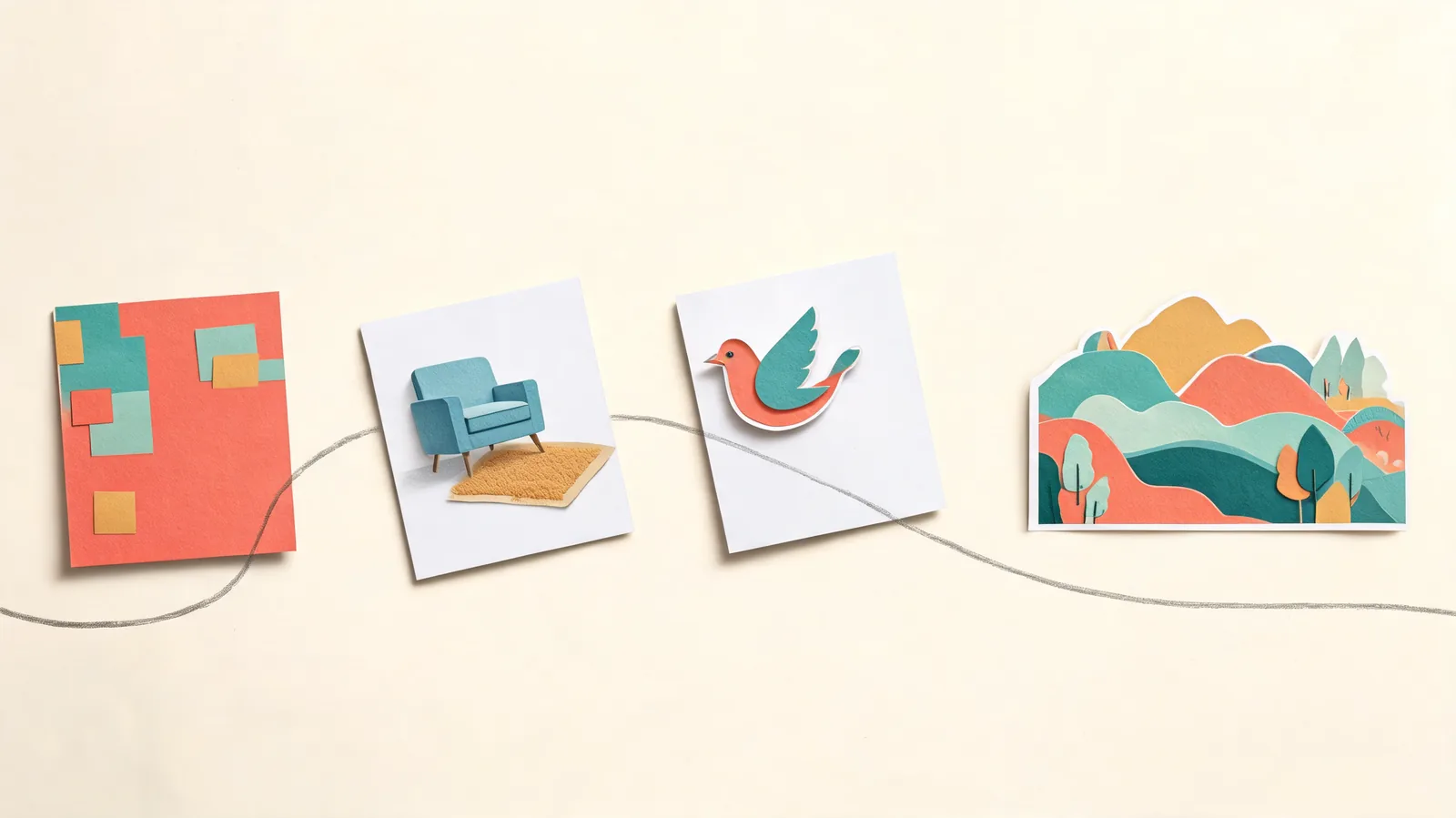
This guide is published by ClipTrend and describes its own generator. ClipTrend is not affiliated with OpenAI. The hero is an editorial illustration; the prompts above are examples to adapt.
Open the GPT Image 2.5 generator with one scene, the references it needs, and a clear destination for the finished image.